But the little boy said…
There are so many colors in the rainbow
So many colors in the morning sun
So many colors in the flower and I see every on…Harry Chapin
 This is certainly one of the most beautiful yet powerful and sad songs written by the great Harry Chapin. One of my greatest challenges in photography is learning to see the world as a child sees it – without a lot of labels. To see colours for their inherent beauty and not just as a descriptor. To see the world as the little boy in Chapin’s song saw it, not as his teacher forced him to see it.
I think as humans we crave colour. It affects us in so many ways. True, a black & white image can be extremely powerful, in part I think because it forces us to see the image in a different way than if it had colour.
My earliest recollection as a child of my father’s work was that it was in black & white as colour was too cost prohibitive to work in. If a client wanted a colour photo, a black & white photo was sent to a specialist who hand-coloured it. By the late ’50’s colour film and paper was starting to become commercially affordable and my father embraced it fully. I believe he was the first professional photographer in Edmonton to move to 100% colour photography which involved a considerable investment on his part. The equipment and chemicals needed to process colour film and make colour prints was much more extensive and expensive than that required for black and white.
These days we take colour photography as a given. Today’s digital cameras can do an incredible job of reproducing the colour in the world around us. Yet colour is a very important element in composition. Effective use of colour can make the difference between a so-so snapshot and a truly incredible photographic work of art.
This has been a long lead-in to say the topic of last week’s composition class was colour. The class started with a review of the previous week’s assignment on Lines. I received some positive feedback on the 3 photos I submitted which was certainly encouraging.
The class then moved into a discussion of colour. How it can affect the mood of a photo, and how it can be used to draw our eye to one part or another of the composition. We learned that colour photography combines red, green and blue (RGB) to form various colours. We also learned that the interplay of Hue, Intensity, and Brightness (Luminosity) creates over 1 billion identifiable colours. Even the best equipment can only reproduce a portion of available colours.
We then moved on to colour harmony and contrast, colour balance, and the symbolic meanings of colours. The class ended with our assignment for the week – to produce three photos illustrating the compositional element of colour, specifically the primary colours of red, green and blue.
When I got home that night I received an email alert that the high level of geomagnetic activity in the atmosphere was creating condition conducive to a high likelihood of seeing aurora borealis overnight. So at 11:00 pm I was out driving in the countryside hoping to photograph the northern lights. They turned out to be quite spectacular that night and I got my “green” photo.
A couple of mornings later I went out at dawn hoping to photograph birds in the golden hour. I didn’t get many bird photos that excited me but I did come across a couple of colourful subjects that caught my eye.
The effective use of colour as a compositional element will continue to be one of the challenges I face as I travel along my photographic journey.
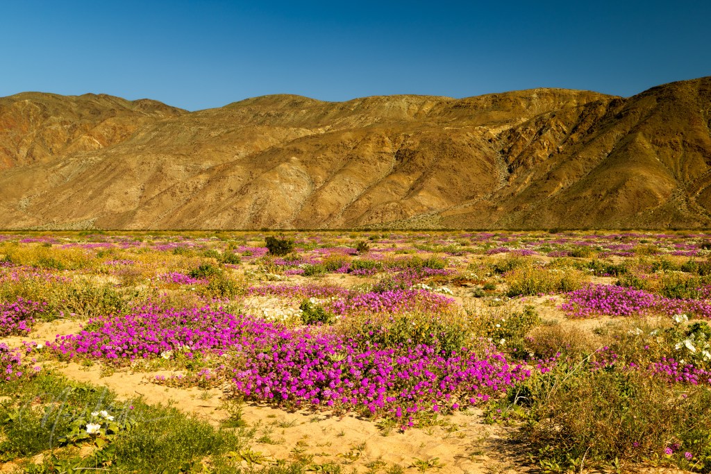
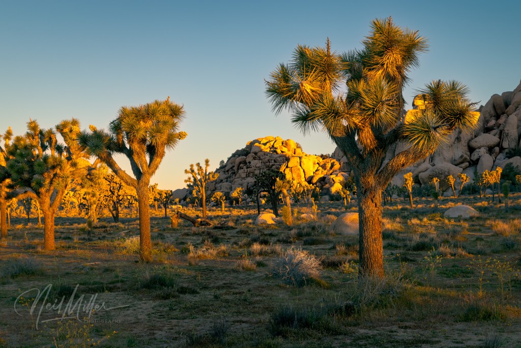
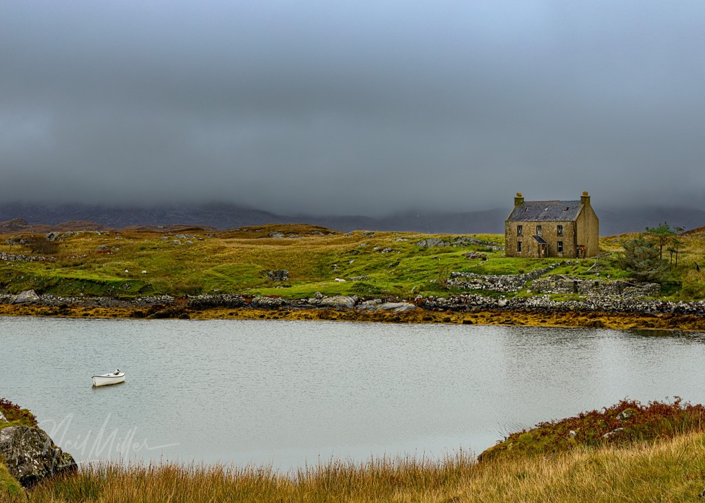
So here are my 3 submissions for this week’s class:


Leave a comment